I’m writing this post mostly for my research friends (especially ethnographers). However, the same principles here are true for anyone who is trying to communicate just about anything. I’ve used illustrations to communicate a biotech’s products to potential partners. Also to explain a startup’s complex technology to investors. But most often, I employ infographics at the service of qualitative research where insights need to be transmitted to product teams or leadership.
While research is about uncovering insights, my work is about getting those insights adopted. Infographics are a tool of persuasion, because persuasion motivates. That’s why I believe visuals ultimately help research get implemented. Here’s why they make such a difference:
People are pressed for time. To be effective today, we need to communicate quickly. A single image can do the work of many words. This saves us time. A highly valuable commodity, whether you are in front of c-suite, investors, or your customers.
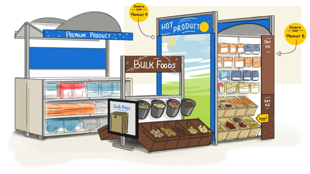
Imagine writing a description of the concept illustration below. It would take several paragraphs to explain. Would people even be able to fully picture it? This is why even simple imagery is highly efficient and information-dense. But this visual power is not just for product concepts alone. We can tap into it to explain qualitative insights.
Places, situations, and emotions help us understand the user and their world. With infographics, we can depict all this information together, so people can quickly grasp everything in context. For example, in one infographic, we embedded insights into the vignettes below. Illustration humanizes data while avoiding PII (personal identifying information) concerns.

To further convey context, we can house research inside of shapes and forms. These shapes become metaphors that explain complex human behaviors. In the Gamer Content infographic below, the loop is a metaphor for their activity. It refolds on itself because gamers are continually discovering new content.
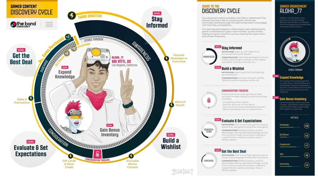
There are infinite options here. A journey can be a wavy line, twist and loop, or branch, which can convey confusion, frustration, excitement, or transition. A fuller picture of your customer emerges when you put quotes, emotional reactions, and insights inside these visual containers.
We want to make it easier for our audience to understand what we are saying. Visuals like graphs, charts, and diagrams can simplify complex ideas, making them clear and digestible. Infographics make it easy to identify relationships, patterns, and layers of information.
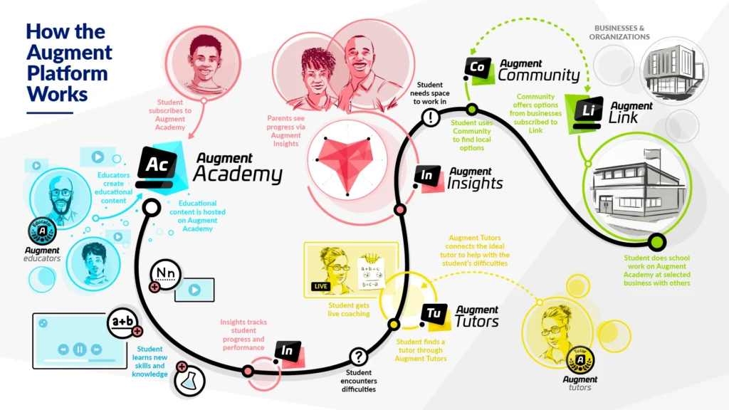
The journey below shows the touchpoints between the user and AugmentEd’s family of products. What emerges is an accessible view of the whole product suite, how they are used, and how they relate to each other. This helped investors quickly understand AugmentEd’s value offering.
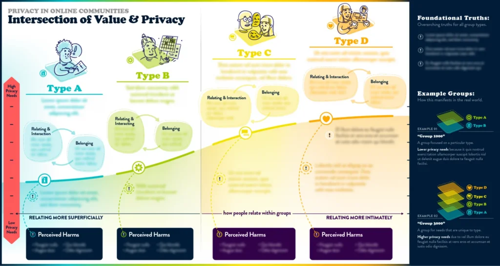
Below is an example of capturing layers of information. This graphic educates developers about online communities and their privacy needs. Placing this information into a graph helps people quickly see how the group’s purpose, privacy needs, relational intimacy, and potential harms are all interconnected. The right panel further shows how groups can include some or all of these categorizations.
Ideas and pictures together are more than either isolated. They can draw teams to the most important insights and changes that can positively move them.
Humans are visual creatures. We are programmed to be drawn to the beautiful or intriguing.
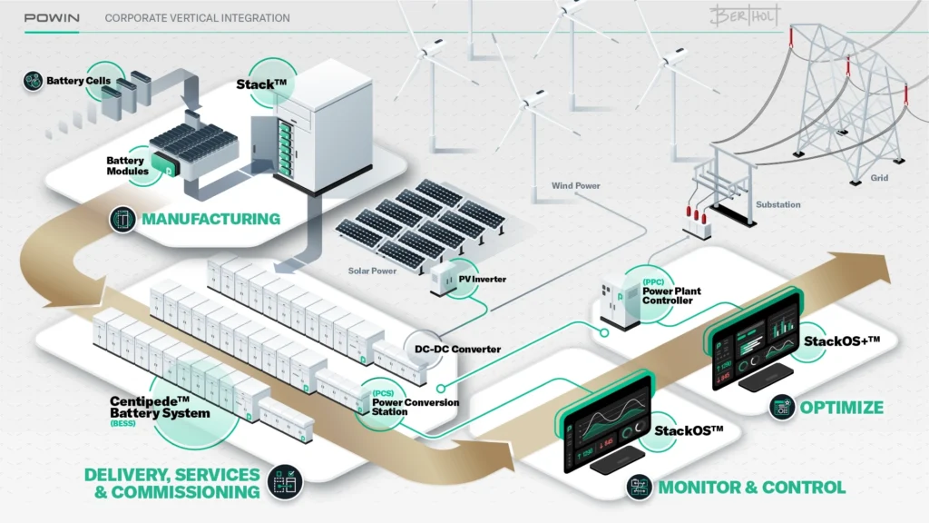
The graphic below shows how the company Powin manufactures, installs, and continually monitors products. We could have told this story with three simple boxes, some icons, and some words. But when we depict information in a new or dynamic way, people lean in to study it.
Visuals help keep your audience involved and focused. This is especially important today, when we are fighting for brain space. We all carry incredibly sophisticated addiction machines called smartphones. So, we need to employ every tool we can to arrest people’s attention.
But art is inspiring. Compelling visuals combined with insights make a sharp tool every researcher needs to tap into.
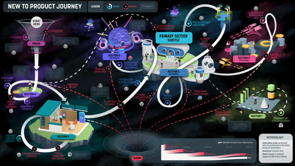
With graphics, you can skim or deep dive. You can also choose to ignore what isn’t pertinent to you. The user journey below shows insights for different parts of the product. Designers or engineers can easily refer to the areas they are working on. You can also quickly see the bigger picture emerge: a chaotic user experience with heavy churn.
By contrast, video forces you to commit to digesting all the content in a certain timeframe. This isn’t a jab at video; it’s just a limitation. Video is indispensable in many situations, but with some content, a few graphics might give you more traction.
We want teams to keep returning to the research. It may be hard to get them to open up a PPT deck every month. However, a poster or quick reference card is a useful way to keep the most important insights handy.
Humans have very good visual memories. Probably because being able to navigate was a matter of life and death for humans for millennia. Today, you can probably easily tell me what is in every drawer in your kitchen. And it didn’t take you long to remember it when you first organized it.
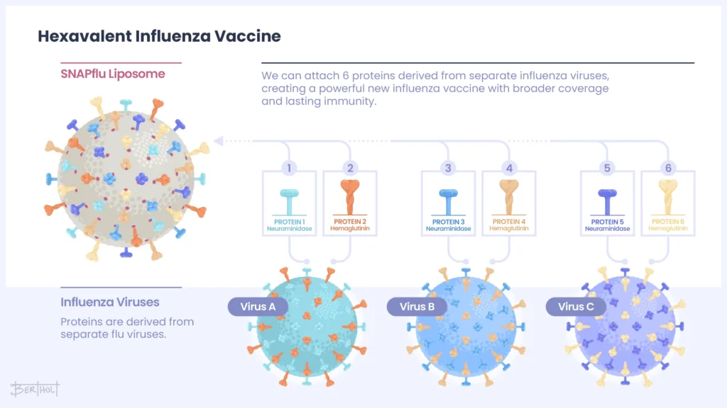
So, if we can translate bullet points into pictures, we tap into this visual memory. Abstract ideas become stickier. POP BIO has a method for creating a vaccine that can fight multiple viruses. The graphic below shows how they can attach proteins from each virus. Putting this into visual form explains what they do and fixes it in our memories.
Years ago, I designed a purchase funnel loaded with JTBD’s (jobs to be done). On presentation day, one of the clients remarked, “This is the coolest fucking research deliverable I’ve ever seen.” Being “cool” isn’t the goal. But having something “cool” like this helps people remember your work and want to see more. And this is what we are all after. Engagement.