There are many different kinds of online communities. How can we educate product teams not only on these types of groups, but the specific issues and needs of both moderators and members?
You’re talking to the King of Infographics, so of course I’m going to tell you how visuals are a great solution to this problem. This project is no different! However, it was particularly cool because there were many layers of information and insights.
We have two perspectives: the moderator and the member. We also have four kinds of groups based on their purpose, which determines their privacy needs. As always, loose sketching is the place to start. What I search for in this exploratory phase are the correct containers, metaphors, and visuals that will aid understanding.
This step is so important because it allows for discovery. Sketches make it not feel sacred or finished – which gives us all permission to hone it into what it needs to be.
AI can put your research into an infographic template in 5 minutes. But it cannot tell you the correct information hierarchy. It can’t suggest what would be better as a little illustration or what ways will help it be understood more quickly. That 5 minutes buys you aesthetics with no purpose or strategy. This is why I sketch.
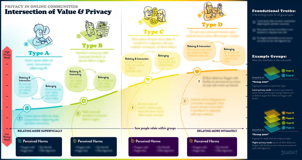
I can’t publish the research, but I can show you the designs-that’s why everything is blurry. This first graphic explains the four basic values of groups. The relational intimacy level is plotted on the x-axis and the corresponding privacy needs across the y-axis. The right panel shows that groups often offer multiple layers of these values.
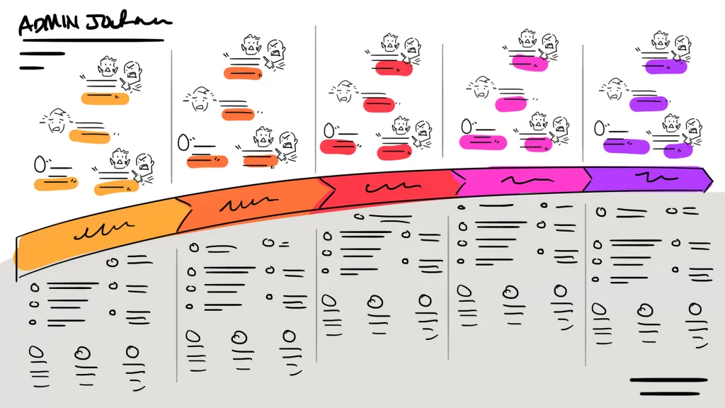
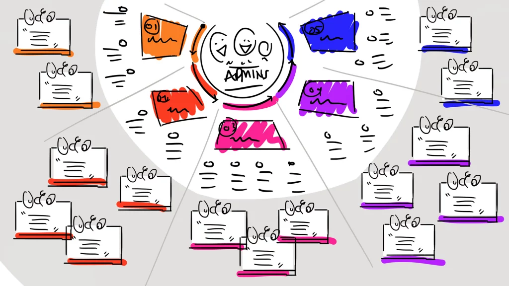
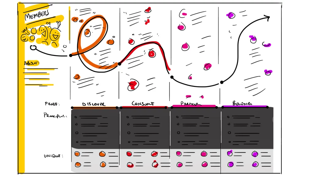
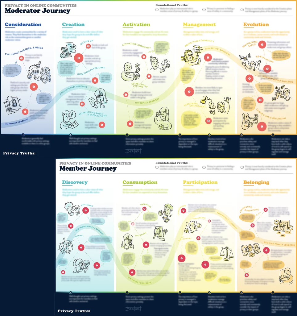
Admins have a journey that takes them from the moment of creating a group to moderating it. Each stage has its own concerns. Members also have their own journey. The red warning dots mark issues with the size of the red circle denoting severity. These two graphics align as you can see below. What is “management” for the moderator is “participation” for the member – these things are happening concurrently.
Researchers uncover insights. I translate research into visuals that help researchers socialize their insights and help people digest them.