How do we visualize consumer insights—in a compelling and memorable way—so key data doesn’t get lost in PPT purgatory?
The Band Consultancy is a human-centered research collective. The company uncovers rich insights by delving into the human story. As a storytelling partner, I’ve crafted a dozen visuals for brands including Facebook, Instagram, Oculus, RayBan, and Lululemon. But we can’t show you any of that! (Sorry, it’s waaay too confidential.) So, to help people understand what we do, we partnered up to create this mock infographic.
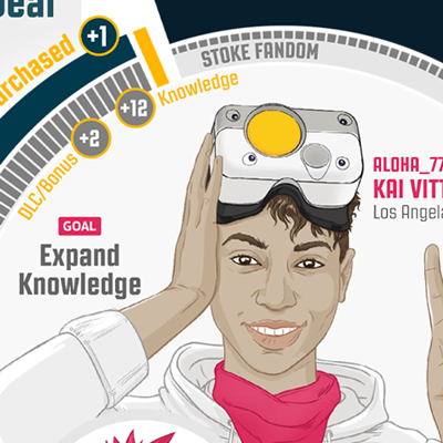
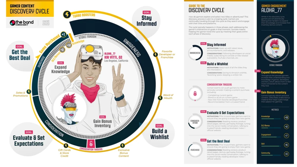
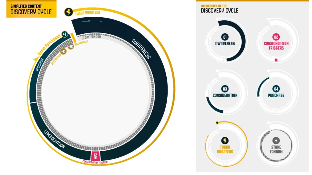
Infographics are one part serious research, another part art, and a little bit of visual science. The goal is always to make something that’s clear, memorable, and true to the user. For journeys like this, different visual metaphors are critical in grounding the viewer in the user experience. The shape of the journey line — whether wavy, branching, or looping — conveys the actual customer experience. We went with a looping cycle (as seen here) to show how gamers continue engaging with new content – which leads to purchases and increased fandom.
We know by now that once insights are presented to clients, they typically don’t go back and review research reports or PPT decks. However, they do keep using visuals created from those insights. One team we worked with—three years later—still refers back to the User Journey Map we created.
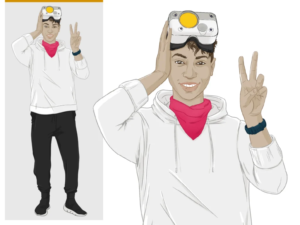
And since we are talking about humans, it helps to have a face, right? With security and confidentiality concerns around using real people and faces, illustrations become a wonderful way to bring human life into data that can feel bland. I always like knitting characters into these graphics; this helps remind us that we’re dealing with real people. After all, qualitative data such as this is rich with human emotion and experience.
People remember visuals—they are “sticky”, especially in our media-driven culture. Research-based insight visuals always present fascinating design challenges that I love to solve. “How do we communicate this visually?” is a question that always gets me excited!